
Price Tags on Tech Companies
As investors, we are always paying attention to the valuations that are being set by both public and private markets.
Today’s post is a review of current public market valuations, how we see that flowing through to private markets, and where we see things going from here.
- Background: Government policy
- Impact of Policy on Asset Pricing
- Public Markets
- Private Markets
Background: Government policy
First, let’s start with a review of the recent public market multiples for US stocks, and recount how we got here.
We believe that much of the market performance in late 2020 and 2021 was the result of actions taken by governments around the world – notably the United States federal government, the ECB and the European Union, Japan, the UK, and Canada.
These governments embarked on an unprecedented expansion of balance sheet purchases in March 2020 (see Chart 1 below), something central bankers have referred to “Quantitative Easing.”
As the economy went into a recession in March 2020, the Federal Reserve started buying securities in order to stabilize the financial markets, which had gone into a freefall that endangered the balance sheets and reserves of lending institutions. When the Fed purchases securities from nonbanks, which is its normal practice, it gives the seller a check or payment, credited to the seller’s bank deposit account. This increases the money supply, which is basically the currency and coins held by the non-bank public, plus checkable deposits / travelers’ checks (that is called the “M1”), plus savings deposits and money market accounts (in total, that’s the “M2,” which is today the Fed’s broadest measure of money).
Prior to 2008, central banks in major developed economies with free-floating currencies had never engaged in large scale purchases of financial assets, with the exception of a few cases where those assets were “troubled” or likely to end in a default. The only instances have occurred during financial panics (such as the Panic of 1792, the Great Depression, the 1980s bailout of savings & loans, when deteriorating assets threatened to capsize lending and savings institutions) as opposed to a decline in economic activity.
Chart 1: Fed Reserve Monetary Policy
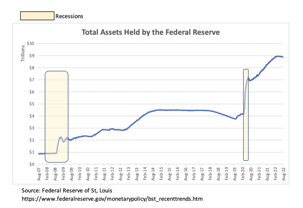
Back in 2008, the US Federal Reserve engaged in the purchase of mortgage-backed securities that were perceived as “high quality,” and unlikely to default, as a way to restore confidence to the market for mortgage-backed securities and prevent banks from being overrun with losses. During that financial crisis, the Fed began its “Quantitative Easing” program and expanded its balance sheet. But at the same time, commercial banks were busy shrinking their loan books and writing off losses from mortgage debt and securities. The Fed was really only offsetting the contraction of commercial bank balance sheets. From 2010 to about 2019, the Fed’s broadest money measure, M2 money supply, averaged only 5.8% a year.
This time around, banks continued to lend and so the money supply expanded rapidly, by between 20-25% annually from May 2020, through all of 2020 and the first half of 2021.
In addition the US federal government initiated several major fiscal stimulus programs, including:
- The CARES Act (the “Coronavirus Aid, Relief & Economic Security Act”) in March 2020, a $2.2 trillion dollar spending plan; and
- The American Rescue Plan in March 2021, an additional $1.9 trillion plan.
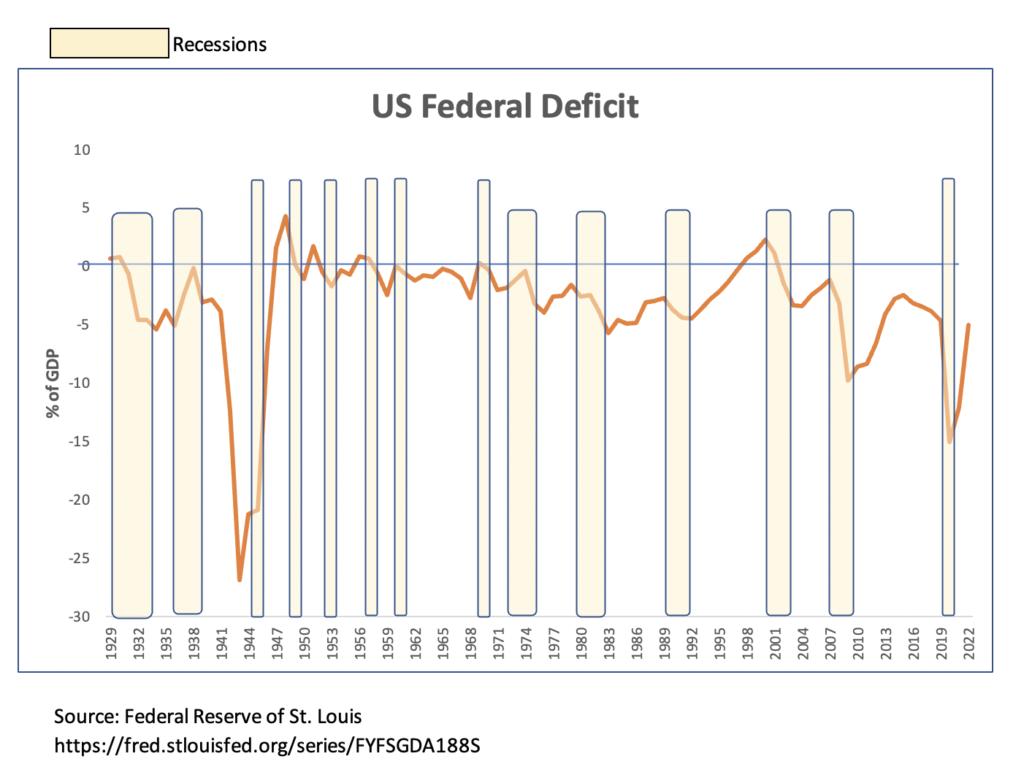
The fiscal deficit had averaged $600B annually from 2013 to 2019, and blew out to over $3.3 trillion in 2020, equivalent to just over 17% of GDP … far more than the fiscal response to a near meltdown in our financial system in 2008-2009, when the deficit maxed about 10% of GDP.
Chart 2: US Fiscal Policy
Now, the US was not alone in adopting these policies. In fact, every major world economy seems to have engaged in a similar expansion of both fiscal deficits and also a series of “Quantitative Easing” actions (the purchase of government-issued bonds, that expanded the money supply). However, the US has been the largest financial contributor to the creation of excess demand, both in terms of the impact of its fiscal stimulus and by the creation of additional US dollars flooding into global financial markets as a result of loose monetary policy.
Here are the annual fiscal deficits, as a % of GDP, for the largest seven economies in the world, excluding China and India (where the numbers have been published yet):
Chart 3: Global Fiscal Policy
| Country | GDP (2020 $) | 2019 surplus | 2020 surplus | 2021 surplus |
| United States | $20.9 trillion | (6.4%) | (15.3%) | |
| Japan | $5.1 | (3.0%) | (9.0%) | |
| Germany | $3.9 | 1.5% | (4.3%) | |
| United Kingdom | $2.8 | (2.2%) | (12.8%) | |
| France | $2.6 | (3.0%) | (8.9%) | (6.4%) |
| Italy | $1.9 | (1.5%) | (9.6%) | (7.2%) |
| Canada | $1.7 | (0.0%) | (11.2%) |
Source: OECD data; https://data.oecd.org/gga/general-government-deficit.htm
Impact of Government Actions on Pricing
We can debate whether or not these government actions were smart, effective, or actually improved the fundamental underlying health of these economies. What we CANNOT debate is that these actions caused the prices of every commodity, real asset, and financial asset to go haywire.
What we saw very quickly was an adjustment in financial assets and in commodities, which began rallying within days of the Fed actions and the announcement of the first large stimulus package by the government, the CARES Act, on March 27, 2020.
Almost immediately, bonds began rallying as central banks around the world started easing interest rates. Then within a few weeks, the broader equity, bond, and commodity markets bottomed in most major economies, and began a sustained rally. The major stock market indices bottomed in late March … March 18 for the DAX Performance Index in Germany; March 19 for the NASDAQ Composite and the Japanese Nikkei 225 Index; March 23 for the S&P 500 and UK FTSE 100; and March 24 for the Dow Jones Industrial Average.
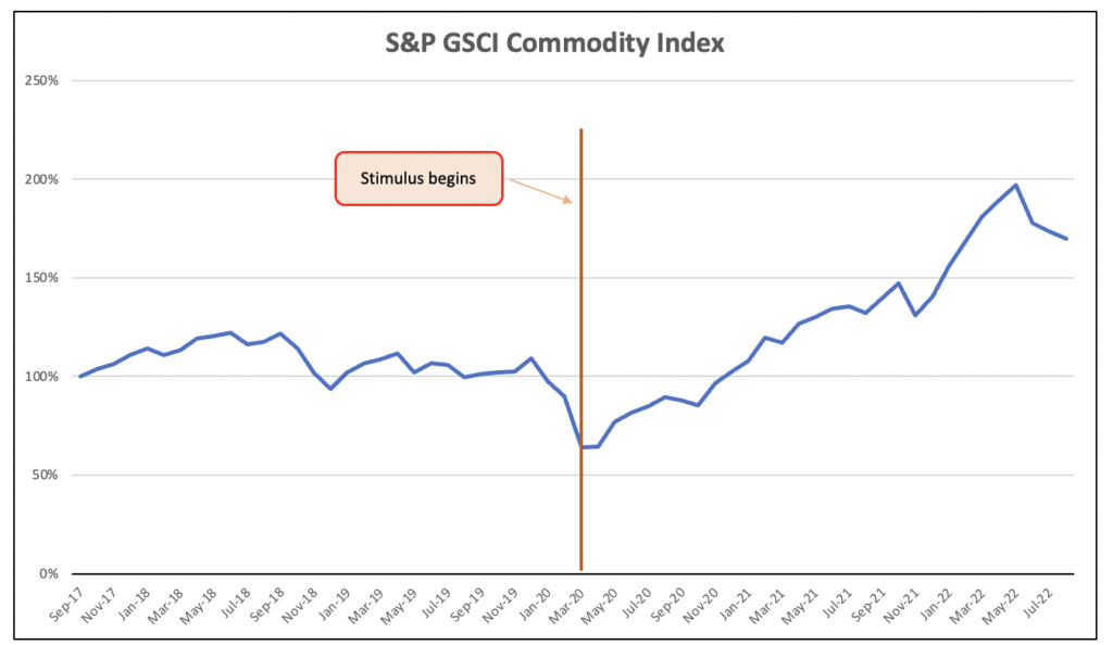
The S&P GSCI Commodity Index bottomed around April 21, 2020 – this benchmark is made up of 24 exchange-traded commodities including energy (crude oil, refined oil products, natural gas) precious metals (gold, silver, platinum), grains (wheat, corn, soybeans), soft agriculture (coffee, sugar, cocoa, cotton) and industrial metals (zinc, copper, aluminum, steel). By the end of 2020, all of these commodities and financial assets were up 20% or more from the date of the stimulus.
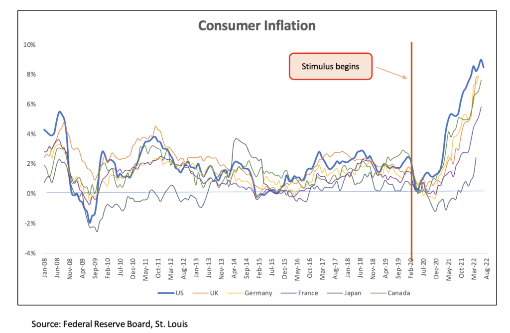
Eventually, the pricing flowed through to consumer prices, with inflation in most of the economies mentioned to soarin to 40-year highs in early 2021. This inflation has affected all of the world’s major economies, with just a few exceptions – Japan (where monetary policy has been loose, with negative interest rates, since 2016, and the economy had been resistant to inflation for various reasons); and places like Switzerland, the Middle East / GCC, where the banking authorities didn’t pursue an expansion in the money supply.
Chart 4: US Consumer Inflation
But this change in pricing has shown up in a variety of other places as well, most obviously in the prices of assets – real estate, stocks, bonds and digital currencies. The major assets owned in the US include stocks (about $50 trillion), bonds (around $50 trillion), real estate (about $40 trillion), and then smaller areas like gold (around $10 trillion) and crypto currencies (about $2 trillion).
Charts 5-8 show how all of these assets exploded upwards, very soon after the fiscal and monetary stimulus was applied.
Chart 5: US Housing Prices
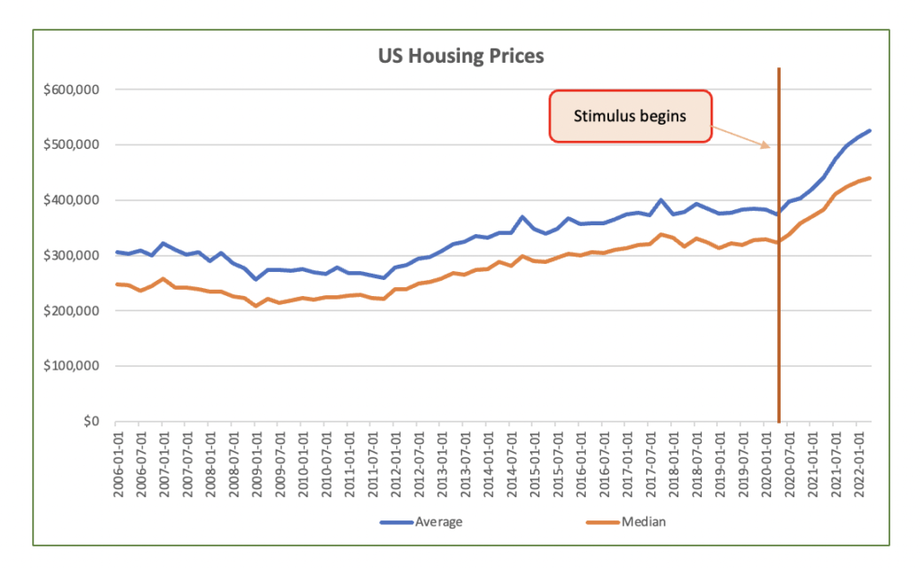
https://fred.stlouisfed.org/series/ASPUS | https://fred.stlouisfed.org/series/MSPUS
Chart 6: US Stock Market Indices
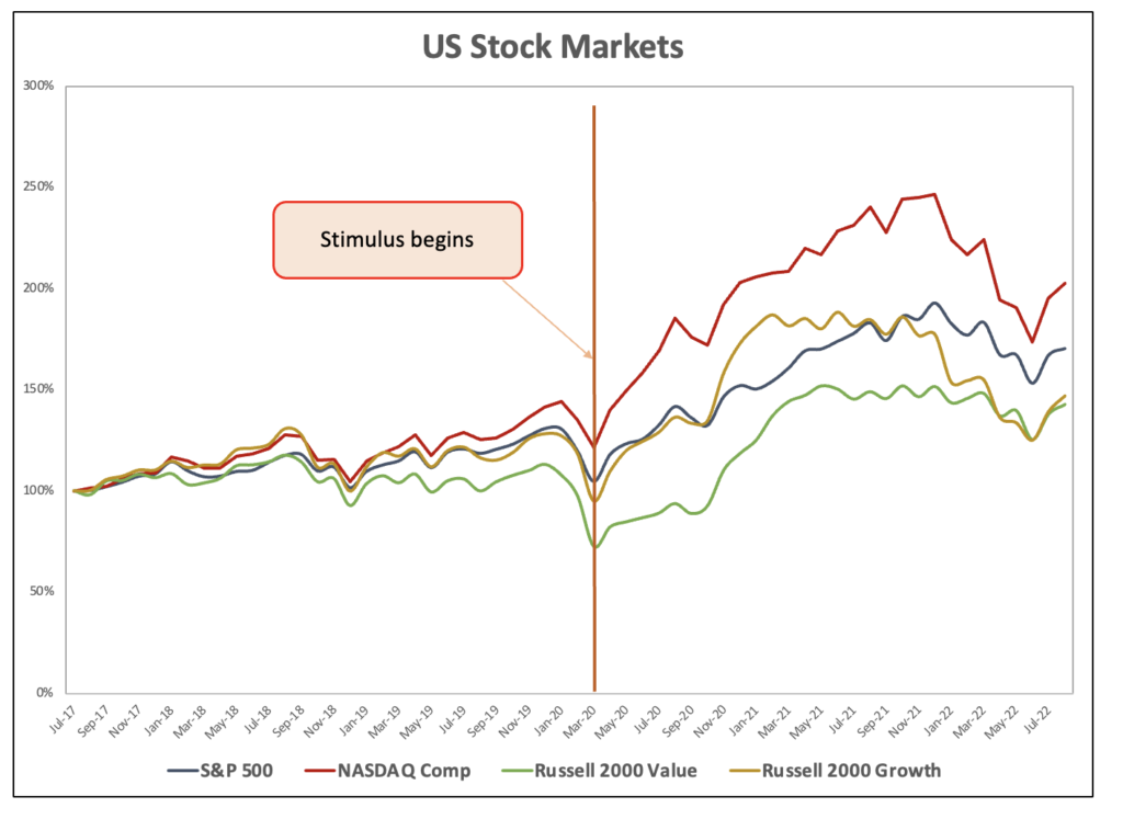
Chart 7: Price of Bitcoin, Ethereum
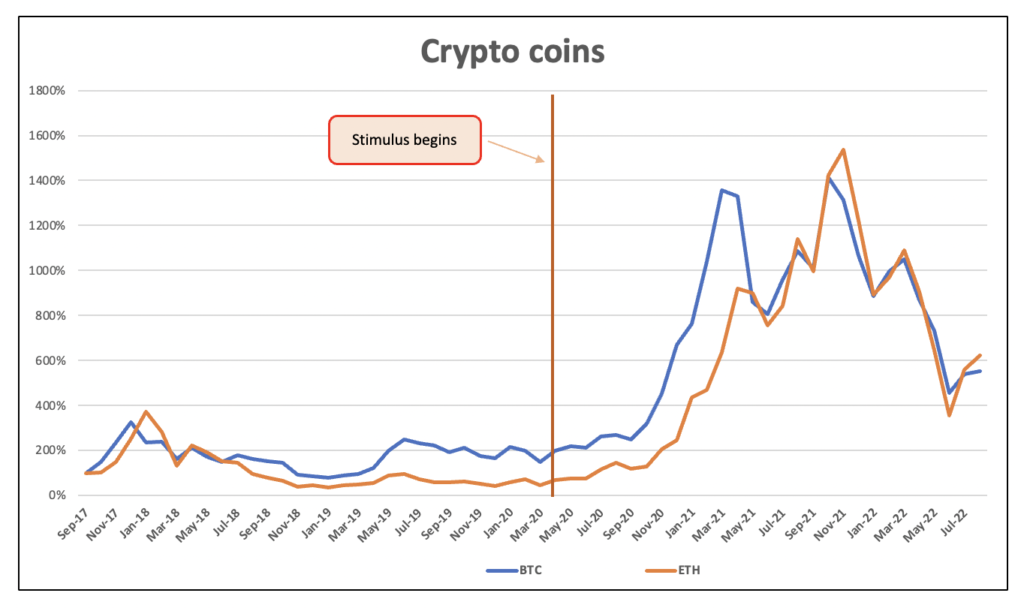
Chart 8: Commodities
Where Are Public Markets Now?
As the Fed had started reigning in its “free money” policy of zero short term interest rates and bond buying, the reverberations are being seen in all of these assets. The most severe drops have happened exactly where you’d expect as liquidity dries up: speculative high-risk markets (such as crypto currencies), and unprofitable high-growth stocks where the expected cash flows are far out, which are sensitive to rising interest rates.
The math around growth stocks – and why a rising cost of capital hurts them most – is important to understand. The value of a stock is typically seen as the present value of all future cash flows, discounted by some cost of equity. Rising interest rates have pushed up the cost of equity, punishing the present value of discounted cash flows that are far out in the future.
In the US, the large cap S&P 500 (mostly full of mature, dividend-paying companies) is down about 12% from its peak, but the more growth-oriented NASDAQ composite is down just over 24%. We’ve also seen similar trade offs with the “mid-cap” stocks. The Russell 2000 Growth ETF (NASDAQ: IWO) is down 27% from its peak, while the Russell 2000 Value ETF (NASDAQ: IWO) is off by just 13%.
I think now that US public markets have appropriately corrected to reflect the tightening financial conditions, and that the likely medium-term direction of the markets will be sideways or higher … not lower. Here are several key indicators that we look at what suggest that the broader stock markets are near “fair value.”
First, let’s look to the price / earnings ratio of the S&P 500. While investing based on things like “earnings,” “free cash flow” or “profit” might sound quaint or outdated to tech investors, this fundamental analysis is still what drives most investment decisions in the US. I like to look at the market cap of the S&P 500 and compare it to the trailing earnings generated by those companies. On a trailing 12-month basis, the S&P is at just over 20x today, which puts it right on top of the average where it has been since 1971. This measure peaked in 2000 and again in late 2021 at about 27-28x.
I also look at a version of the price earnings ratio that was developed by Nobel Prize-winning economist Robert Shiller around 1996, called the “Cyclically Adjusted Price Earnings ratio.” This measure looks at the ratio of the market capitalization of the S&P 500 and compares it to the last ten years of earnings, adjusted for inflation. Today, we sit at about 31x, which is roughly 23% higher than the recent 50-year average. On this measure, the S&P 500 certainly isn’t historically cheap; however, remember that the Treasury long bond at just over 3.2% today, versus a 50-year average of about 6%, that low cost of capital suggests that the equity multiples SHOULD be slightly higher than the historical norm.
Chart 9: S&P 500 Price / earnings ratio
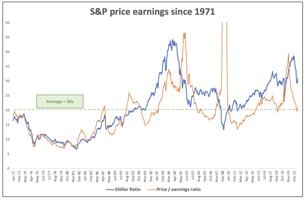
Shiller Index is from https://www.multpl.com/shiller-pe/table/by-year
Trailing 12-month PE ratio is fromhttps://www.multpl.com/s-p-500-pe-ratio
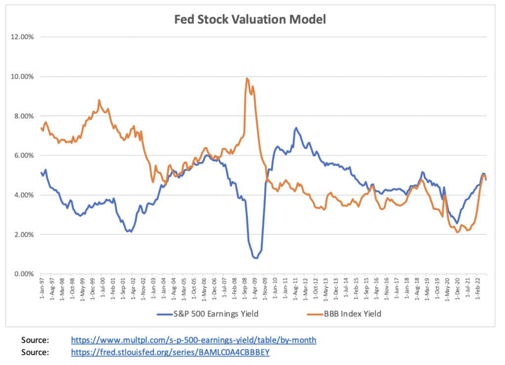
Another way to assess equity valuations is to compare the earnings yield on the major indices with the yields available on their corporate bonds. Ed Yardeni has done some great work in developing and refining a tool called the “Fed Stock Valuation Model” that compares (a) the “trailing earnings yield” (which is the last 12 months of dividends plus earnings) on the S&P 500 stocks, with (b) the an index of BBB corporate bond yields.
The chart below shows how the corporate earnings yield has compared to bond yields over time. Notably, these lines tend to track each other quite closely over longer periods – they do diverge from time to time, but once they do, they tend to come back together again.
If the lines are running separate, and the “corporate earnings yield” is significantly greater than the indexed “corporate bond yield,” that suggests that equities are undervalued and represent a better investment. This condition was true for 2010 through 2015, as well as most of 2020-2021 … and in fact US stocks in all of these years did very well in all of these periods. When the opposite is true and the “corporate bond yield” exceeds the “corporate earnings yield” (as it did in the late 1990s through 2002, that suggests that equities are overvalued, and are set up for a sharp fall. And in fact, corporate bonds proved to be the better investment in the late 1990s. Equities performed well from 1996 through 1999, but from 2000 to 2002 they gave up all of those gains and more, far underperforming corporate bonds.
When the lines are close together, this implies that both stocks and bonds are “fairly valued.” This happened most recently from late 2015 through early 2019 (a period of decent equity returns) and before that 2004-2007 (also a period of small but steady equity gains). As of now, the lines are back on top of each other, indicating that equities are back to “fair value,” which is not a “buy” signal for stocks but suggests that stocks are now approximately fairly priced relative to bonds.
Chart 10: Fed Stock Valuation model
How Are Private Markets Responding?
Public markets have corrected very quickly in the first half of 2022. Once public equities markets understood the new direction of the Federal Reserve Board and the other major central banks, price / earnings multiples for the broader index and the relationship between corporate earnings yields and bond yields reverted back to historical means within a few months.
But private markets take a lot longer to adjust to these new valuations. There are a few reasons for this:
First of all, private market valuations are typically set only periodically by a company’s last priced round … that is, the price of a private company’s stock is just what a single willing investor (the “lead investor”) is willing to pay for newly issued shares. Companies have a lot of discretion over whether or not they will do a financing, and on what terms, so if companies aren’t being offered prices that they feel are fair, they will simply defer the financing into the future. A publicly traded company may see its traded stock price by 40%, but a private company with illiquid stock may just report that its valuation was “unchanged,” and may continue to defer any stated write-down of its valuation until it had to negotiate a new financing with an investor.
Second, we think there’s a huge selection bias affecting venture valuations. In Q1, the venture industry saw a huge drop in deal-making. According to CB Insights “State of Venture – Q2 2022” report, global venture funding saw $108.5B raised across 7,651 deals last quarter — marking the biggest quarterly percentage drop in deals (and the second-largest drop in funding) in a decade.
That means that a lot fewer companies got funded in the first part of 2022. The companies that can even raise right now in this tough environment are going to have to have a very strong story … outstanding growth, unit economics, manageable burn rates. When only the best companies can get financing, the valuations being released in the press are then affected by a quality bias.
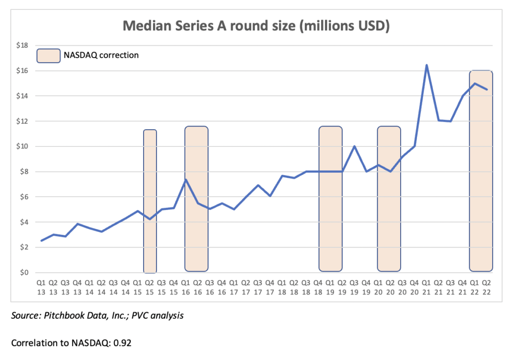
For these reasons, we haven’t seen Series A / “early stage” valuations drop very far. The chart below shows the median Series A round sizes over time, with NASDAQ “corrections” (i.e. a peak-to-trough drop of 20% or more) in red. Over the last five of these corrections, the median round sizes react but usually by less than the public market drop, and often with a bit of lag, usually about 6 months before the effects are fully felt.
We like looking at round sizes as a proxy for valuation, because companies and their investors can game a “valuation” or “market cap” … companies sometimes will sell shares at a premium price to protect their valuation, but throw in valuable consideration for those investors as part of the bargain (e.g. preference, liquidation preference and “ratchets,” guaranteed returns, control provisions, etc. But it’s much harder to game the size of the round that a willing investor is willing to do).
So far in 2022, Series A round sizes have dropped just less than 5% from their Q4 2021 peak.
Chart 11: Median Series A Round Size
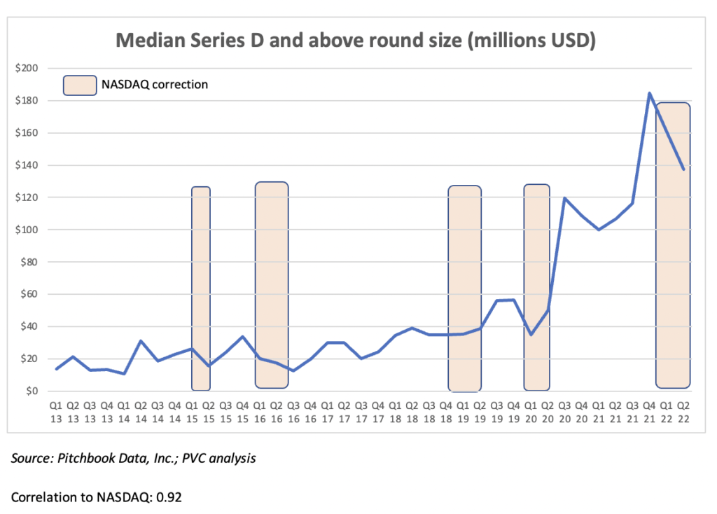
Later stage “growth stage” companies have seen a much faster reaction to the drop in public market valuations. The median Series D round size in the US has dropped by almost 20% from its Q4 2021 peak, which feels a lot more consistent with the 20-25% drops that we have seen in the large and mid-cap US equity indices. We think that’s also consistent with history – over the last 5 NASDAQ corrections, the later stage round sizes have reacted almost immediately.
Over the past few months this rapid correction has been precipitated by the departure of the two largest late stage investors – Tiger Global and SoftBank. Between them, they were the price setters for about a quarter of all VC deals in 2020 and 2021, and both have now reported massive losses and declared their intention to essentially stop doing deals in 2022.
Chart 12: Median Series D Round Size